


Cookpad Studio is a division under Cookpad TV. The studio is a kitchen for cooking and making a short 1-minute movie of your recipe, which the user published on Cookpad Japan. Cameras, lighting and ingredients are all free of charge. Using a studio-specific application and staff help, users can quickly shoot and edit high-quality videos. The movie is tagged along with your recipe, and it is free to share on social media. All the users who wish to use our studio go through these steps:
1. The user must have their recipe uploaded in Cookpad JP.
2. The user must request an email appointment to visit the studio and cook videos.
3. The admin reviews the recipe requested for the shoot, and once the video is curated, they review again and upload it to Cookpad.
The Problem
The constraint of a physical location. Not many users visit the studio.
The Staff needs to guide the user through the entire process, and the process gets time-consuming.
The restriction on using Cookpad recipes
The project was initiated with the request to completely redesign a “satellite” version of the Cookpad studio app for mobile, with the existing studio app (iPad) as a reference point. Overall, Cookpad planned to promote recipe videos as a culture among target groups.
What do we want to create/solve?
- An app for recording and editing a 1-minute video in 2 hrs that makes people go “Wow!”
- Allowing the users to record at home with a software built by Cookpad (i.e. no physical location and staff)
- Removing restrictions on video creation (e.g. must be Cookpad Recipe, review of recipe quality, no branding)
- Aim to provide an environment and tool to create high-quality videos, though shot by amateurs.
Because
- It’s easier to understand and reproduce a recipe from a video
- Cooking videos are inspirational. They can motivate inexperienced people to cook, increasing the number of people who cook.
- The aim is to allow users to film from their kitchen (or other location).
- We do not want to limit this to Cookpad. Non Cookpad users can use the app for cooking their blog videos as well
Maybe... This leads to the high-level objectives of
- Publishing videos can give people the attention they crave, and people want attention (people want likes), i.e. 承 認欲求 (extrinsic motivation) (the result/outcome of a video)
- The act of recording and editing recipe videos itself can be fun and worth doing, i.e. 自己満足 (intrinsic motivation)
Current Status: Both are valid, but we are unsure which one is more important.
Make video creation fun and easy to use at home for passionate home cooks who are low to moderately tech-savvy in video curation.
We started by creating an understanding document through field observation and exploring the current situation of the existing product used at Daikanyama cooking studio. Then, to make more effective decision making, we ensured that the Product makes the decision based on input from Design and Engineering. Finally, we set up an issue posing the question, gathered the information, and decided.
We did extensive contextual inquiry and user testing with existing studio products to understand the user journey and validate the assumptions. i.e., Go where the user works, Observe the user as he works, and Talk to the user about the work.
For this research, I used the Master-Apprentice model:
When you are watching the work happen, pre-planned teaching is not required (Mastercraftsman teaches on the fly)
Master need not remember his work explicitly (Seeing the work reveals what matters)
Competitor Analysis:
I observed their work in process with our current app and with a think-aloud method and understood the delight, pains and blockers they faced while using it. To understand their tech-savviness, I studied their operational instincts with a few of the existing editing apps in the market. I collected insights on what made them easy or difficult to use. With this raw data, I did affinity mapping by creating cohorts. Finally, I understood the areas to focus on and improve when we are getting into the conceptual phase of the tool creation.
Dogfooding:
I mocked the home experience with some quick prototyping of a DIY hardware kit and a third-party app. Finally, I understood the situation in which the user will be using our app and performing. This process helped me to ideate further.
To create compelling hardware which fits users’ needs, I need to study the environment in which they will be working. So, I visited a few Japanese home kitchens to observe the space, lighting and physical constraints.
This study helped me understand that, along with the app, we need to provide a “portable kit” hardware and distribute it to eligible cooks. All the results were captured and documented as a user study. I frequently iterated on the solutions with these results. The experiments on hardware helped me understand the problems in it. So I sketched some hardware ideas and looked for available options in the market. Finally, I had all the insights to build a new kit from testing the previous kits and space study. Which are:
a) a stable pole which is more durable (aluminium)
b) avoid shaking on the phone stand while interacting on the screen
c) Phone holder with an only a horizontal view to shoot
d) Distance between the phone and the shooting object was fixed to 60 cm, which was idle for all framing conditions
e) a fixed/stable phone holder to avoid gyroscope adjustments in plane
f) base of the kit was removed, which let the user decide the background.
g) home lighting conditions are not very significant, which might affect the video quality.
We reviewed and freeze a Core Persona and User story to understand the scenario and problems to solve. Then, I facilitated a design sprint to brainstorm and fix the main features of the app through participatory design. Teammates were involved to set a direction for the product through ideation and lo-fi mockups. The cracked design solution was validated with the product manager and I proceeded with wire-framing them.
I understood the ergonomics of the Japanese kitchen space and people's ability to operate. These studies helped us bring the hardware's initial idea with usability. But the lighting condition will directly affect the video quality, and we cannot expect users to have well-lit conditions and lighting.
Along with the product manager, I did multiple tests with various hardware available in the market. And for the camera, I tested the lighting conditions in multiple environments. The focus was to find the essential features required for the camera in these diverse environments and give better quality output. The result was White Balance, Contrast and Shadows to be the camera's necessary operations to make the product "Oishi" looking.
After testing the lighting conditions and the bad experience in operating the lights, we decided not to add external lights to the kit. However, after successfully using the FilmicPro (third-party app) in the available room light (by mocking the home light environment) and shooting with adjusted camera settings, we decided. This decision made the hardware simpler to handle and helped engineers build the camera in a standard well-lit condition. A photography expert later reviewed this with the same experiment, and then we shared the results with the engineers to make the software for the camera.
During these tests, the product evolved in the path of making it more straightforward. We removed elements like lights, white box, external display monitor and ventilation fan (which we thought would be essential for the kit).
Most completed recipe videos created by our app will end up being around 1 minute long. However, the length of the individual videos recorded and edited can vary significantly.
For example, one cook Mary might record the process of frying beef as 10 seconds putting the beef in the pan, 10 seconds with the beef half cooked, and 10 seconds as the beef has become fully cooked. I would describe this method as editing while shooting. A second cook John might record the entire process of frying beef as a 5 minute long movie, then cut this longer video into the same three sections as Mary did during the editing process. I would describe this method as editing after shooting.
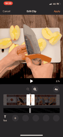
The clip editor screen in the Satellite app is used to trim videos as shot by the camera into shorter clips that discard the boring or unnecessary parts of the recipe. Our initial design of our clip editor screen was tailored to Mary's editing while shooting style. We've found through experience that editing while shooting results in a quicker and easier editing process, and this is why we designed for it first. However, we've seen through our testing that it's not always possible to avoid taking longer videos, even if you are following the editing while shooting method.
Zoom Controls:
I've added two single-tap buttons to the ClipDetail screen.
- Zoom to Fit Video (aka "Zoom Out") - show the entire video file
- Zoom to Fit Clip (aka "Zoom In") - show only the trimmed area of the clip
- Either of these controls may be enabled or disabled in any combination depending on the current zoom level and the position of the clip's left and right trim handles.
Zoom Clips:
The design of the clip editor screen needed to be adapted and expanded to allow proper detailed editing of long video files into short ones.
The second reason a design change was required was that we recently moved text editing into the same screen. Previously, the text editing time area was on its own screen. That screen was automatically scaled to show only the available area of the clip, and was therefore possible to trim the text to the desired start time and end time. Moving this to the same screen as the clip editor changed the scale and made it much more difficult to perform accurate trimming of text. The upside is that now the relationship between the clip and the text is more obvious and it's quicker to make quick trims of the clip and text at the same time.
Assumptions:
The target use case of the Satellite app is very different from that of a general purpose video editing app. We therefore can make a few assumptions that will allow us to tailor our design to our exact use case.
- The target length of a Clip after trimming and rate adjustments will always be less than 15 seconds because the target movie size is ~60 seconds.
- Users add and adjust text on a clip after trimming it to near its terminal length.
- Users usually adjust clips after their initial edit by shortening them (not lengthening them).
Why not allow users to pinch or scroll in addition to the two buttons?
My hypothesis was that pinching and scrolling are clumsy and require too much mental overhead to perform the precise control our users need. With all the current required controls on the screen (playhead, trim handles, text buttons, etc.), there's a very high likelihood allowing scrolling and pinching would frustrate users if it was unintentionally triggered while the user was trying to perform a different action.
Text editor is one of the complicated requirement in our product and it was a tough challenge to crack the solution. I came up with multiple sketches to tackle the issue and finally came up with a design which answers all the below issues. They were:
- Multiple text items can be present in a single clip
- User should know all the position of text items in a clip/scene
- Text items cannot be overlaid on each other
- User should find it easy/comfortable to select a text item with a short duration. Given a long clip, the minimum duration can result in a very small tap area (potentially impossible to tap)
- The feature was tested with multiple users and it worked well with them. Everyone was able to understand the interaction and appreciated its ease of use. Good improvement on original version.
- Clear understanding of the purpose of text editor from a user POV. Clear understanding of how to add multiple text to a recipe and edit them.
We think with data, believe in success's potential, and take action. As a designer, it's okay to make a rough cut and sketches, IA and discuss it with the team, so I'll try to shape it. This approach opens up many possibilities to tackle a problem by creating quality versions. That's where the story begins.
We tested with Cookpad members in Tokyo and across globe to use our product and share feedback. Used the traditional methods in user testing, which involved contextual inquiry and think aloud method. The feedback and observations were noted down and we converted these data into priority of work to redesign or iterate.
By end of March, this brief is essentially a separate fork of the architecture that significantly changes the focus of the app from being a video shooting and editing app that shares to external SNS to a SNS in itself where the published content is videos shot and edited in a separate area of the app. The scope of the product took a new direction by introducing the community of video creators to share videos created with the satellite app.
Community was in active design/development for about 4 months, with product and design beginning in March and development beginning in April and ending in early July.
Because of our small target audience for an initial beta release (~30 people in Tokyo), we made several decisions about the scope of what was to be the "version 1" release (more information in the planning issue).
- Authentication would be tied to the device (i.e. no passwords).
- Users were required to create a profile (username and avatar) on first launch before they could enter the main app.
- Movies would be required to be published to the community first before they could be shared to external sources to ensure there was activity in the community.
- Movies could not be edited again after publishing to mitigate the "multiple publishing" problem.
- No explicit reactions (e.g. likes), but we would register play counts for each movie instead.
- Unfortunately, this first release was delayed until mid-May, when it was first demoed to management and more features/changes were requested, some related to the shooting/editing modules.
The next version included changes to the original scope:
- Change dark theme to light theme.
- Add likes.
- Add a tutorial to the shooting/editing module.
- Add email-based authentication.
I explored various option and came up with a design the community feature for Cookpad Studio.
The community features exist in service of video creation. The community supports the creators to inspire them to continue to create videos, and get better at doing it. Every video creator have a profile screen to show their creation.
From here, a redesign of the shooting/editing modules was initiated. The initial design for the community feature screens are dark, high contrast and had some hard edges, giving the visuals a very technical feel. This did not fit with the intended target user profile in Japan. Revised the visual design to be welcoming, while remaining simple and subtle.
The beta test was successful with all Cookpad users could create videos with minimal issues.
Novice and non-tech savvy users found our app to be easier than iMovie to operate.
Each test users created around 3 recipe videos/week on an average. It exceeded our goal of expecting a maximum of two videos from each beta test user.
The app created a positive impact on the lives of middle-aged women. They got passionate about cooking and vlogging their cooking experience in SNS.
Most of the beta test users we tried wanted to create the videos over and over again. This user behaviour makes you realise that your product is going well and the consumers are loving it.
We launched the app in mid-2020, and it is still getting positive feedback and star ratings from users.
You can download the app here: App store
Product Management - To revisit the design document frequently and put it up so that when the product scope or vision deviates, I should be the gatekeeper to alert and make the product stay in line and focus.
To write about Interaction rules behind every step. I delivered the interaction doc in a new format. It was succinct and explained the interaction to developers well.
Learned a new skill set apart from software. Went above and beyond for the consumer.
To do frequent feedback loop: I collaborated closely with product and business owners, maintaining a frequent feedback loop on design decisions ensuring the product owners were well-informed.
Help to grow the Design and Development team at MPG by hiring new talents.